
Comvita
Brand Marketing Strategy & Content Design
Blending Global Identity with Local Flavor for a Health-Conscious Icon.

Deliverables:
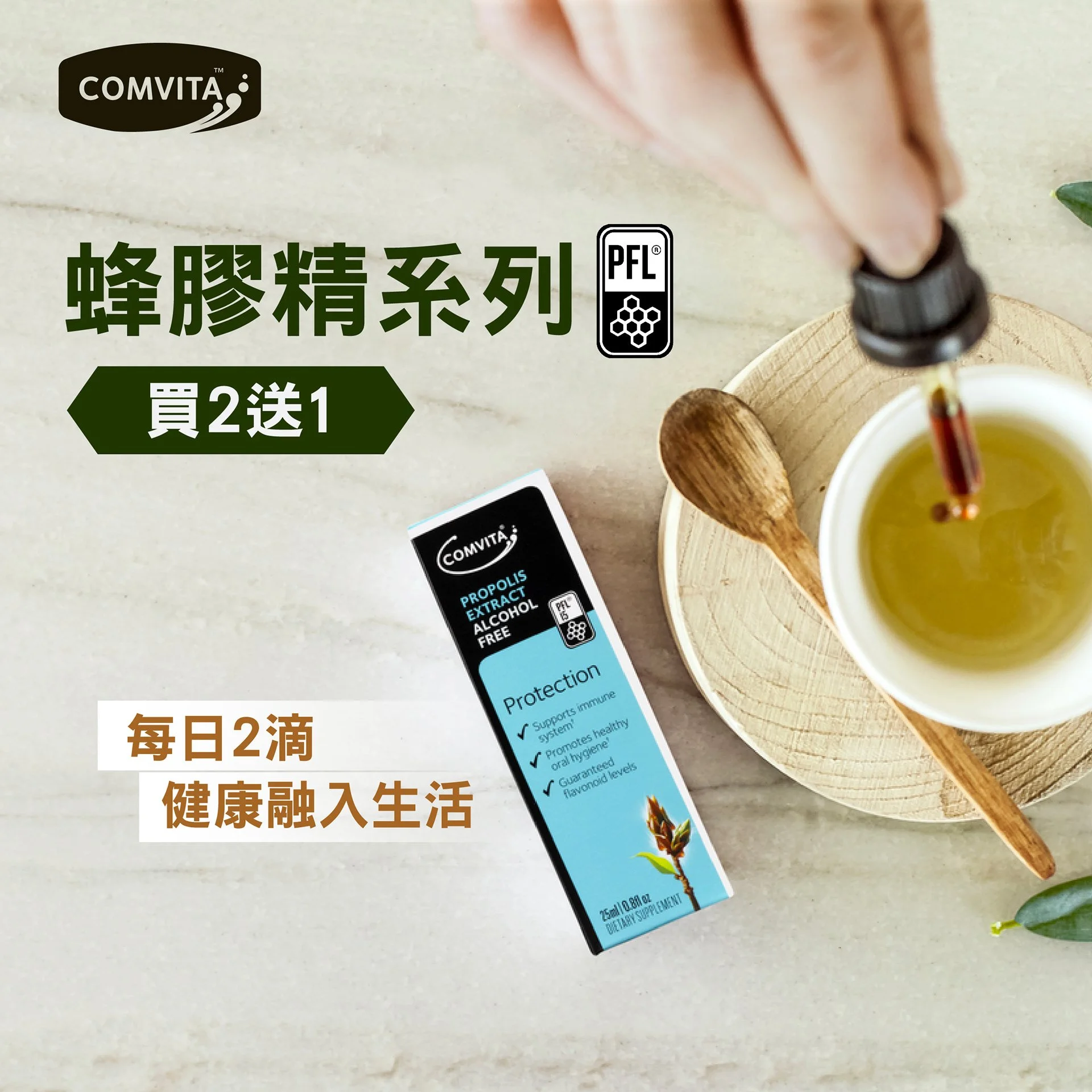
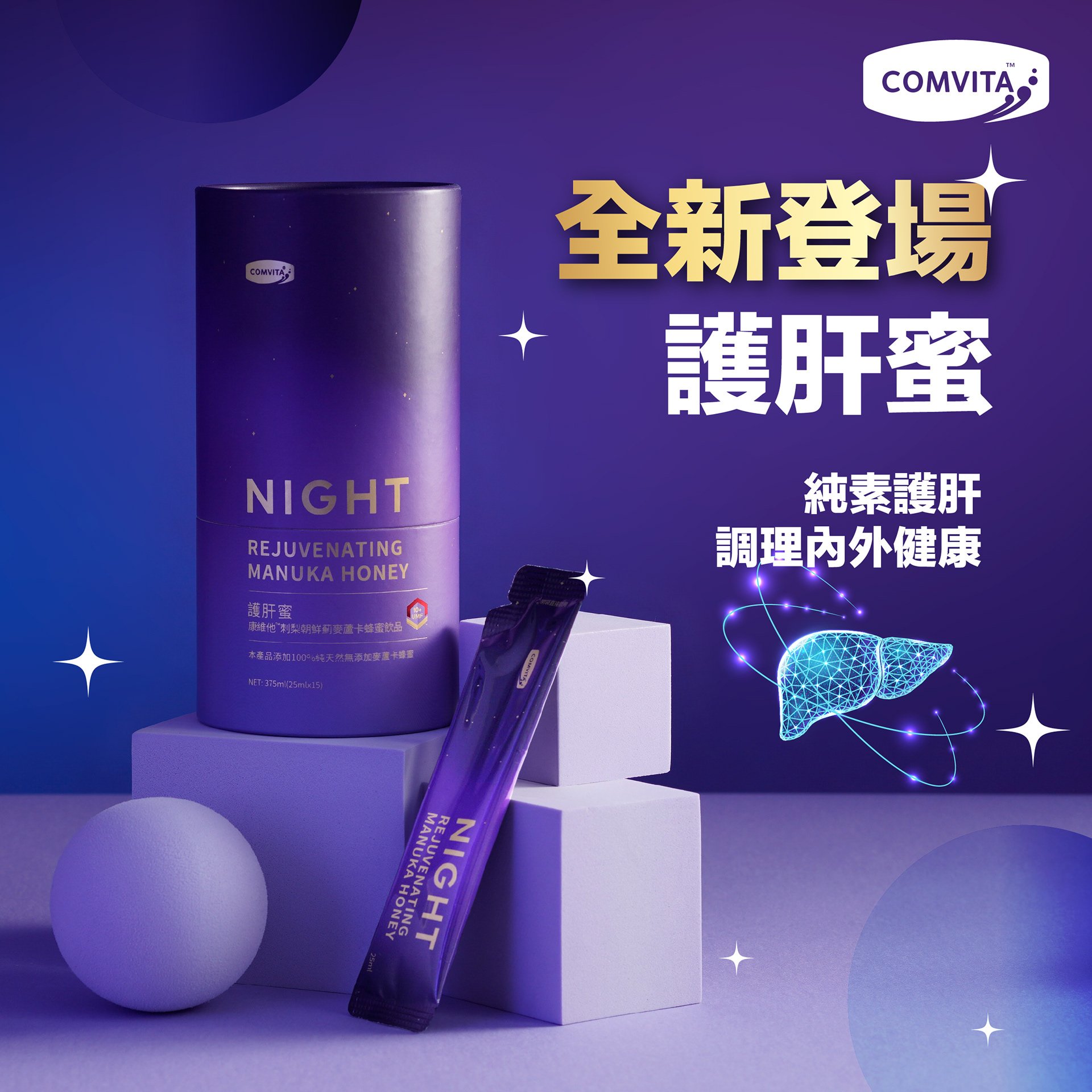
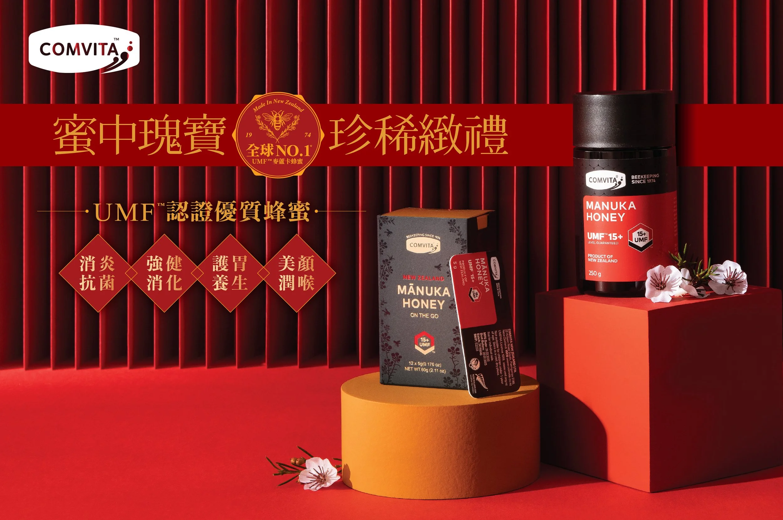
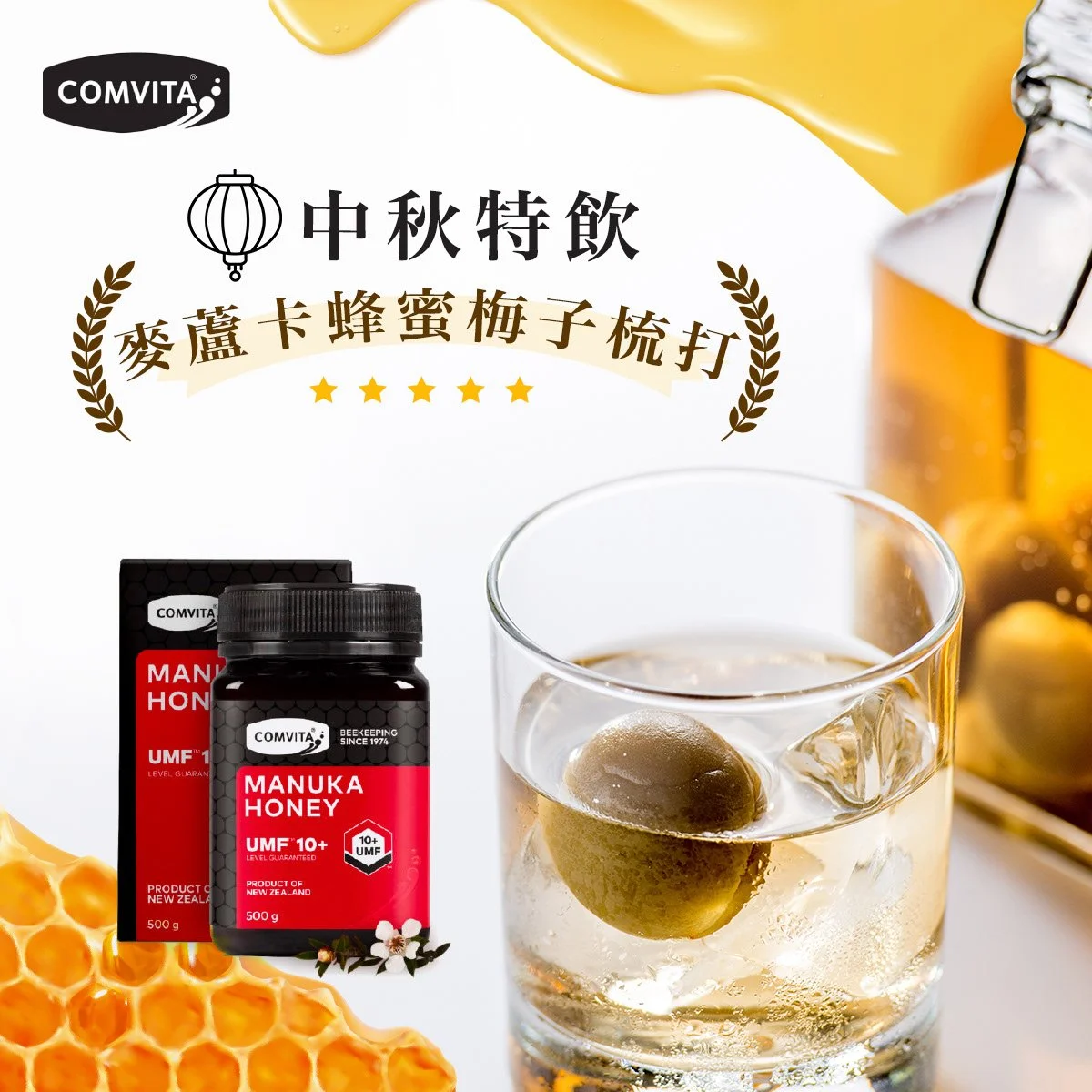
Key Visuals Design . Photoshoots & Styling . Social Media Design For Multiple Platforms (Instagram, Facebook, Youtube)
Comvita is a globally recognized leader in Manuka honey, celebrated for its purity, potency, and scientific credibility. While the brand is trusted for its heritage and expertise, the challenge was to shift perceptions of honey beyond tradition—making it part of today’s wellness-driven lifestyles while preserving its scientific authority.
My Role: Content Art Direction · Social Media Strategy · Visual Localization · Retouching & Layout · Product Shooting
Tools Used: Photoshop · Illustrator · Lightroom
Strategic Approach:
Blending Nature with Science
My creative strategy centered on bridging traditional perceptions with modern relevance, using design and storytelling to make Manuka honey feel essential for contemporary living.

Creative Execution Across Channels
Digital Campaigns: Designed modular campaign assets for Instagram, Facebook, and in-store displays, allowing scalability across regions and audiences.
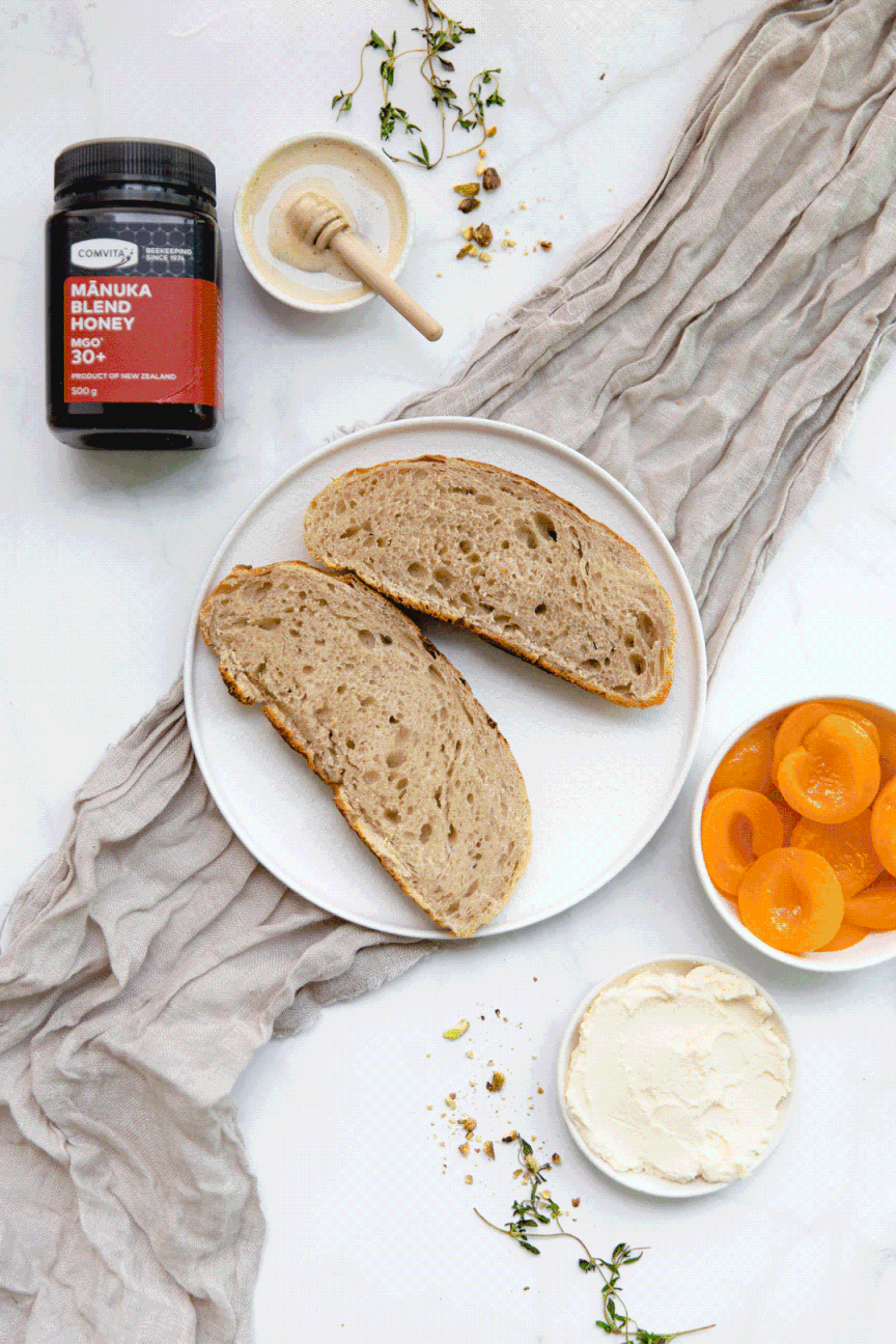
Visual Language: Crafted concepts rooted in natural light photography, close-up textures, and minimalist layouts, emphasizing the raw beauty of honey while reinforcing scientific credibility.
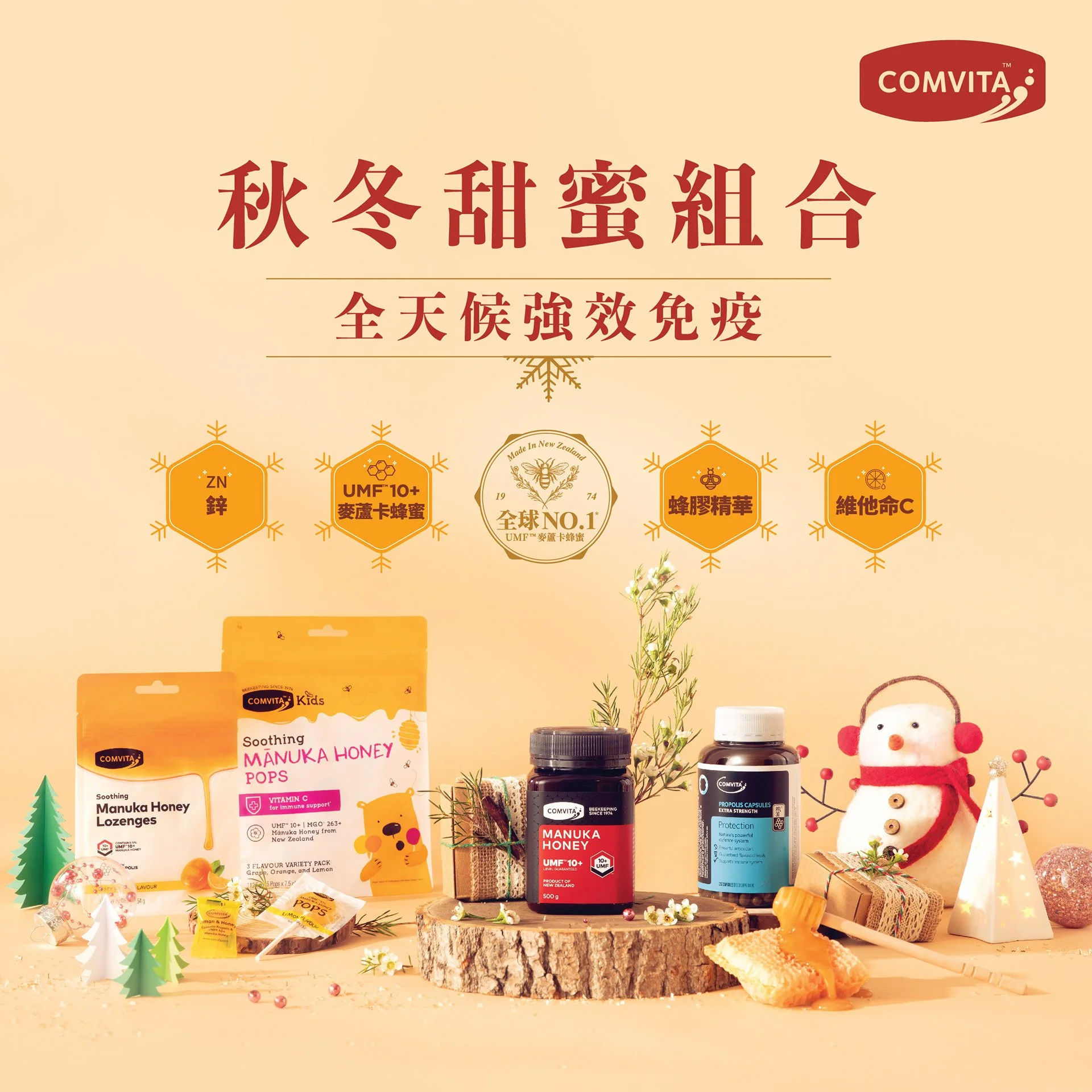
Contextual Storytelling: Built relevance through seasonal angles (e.g., immunity support during flu season) and everyday rituals (family wellness kits, travel packs, skincare integration).


My creative strategy centered on bridging traditional perceptions with modern relevance, using design and storytelling to make Manuka honey feel essential for contemporary living.
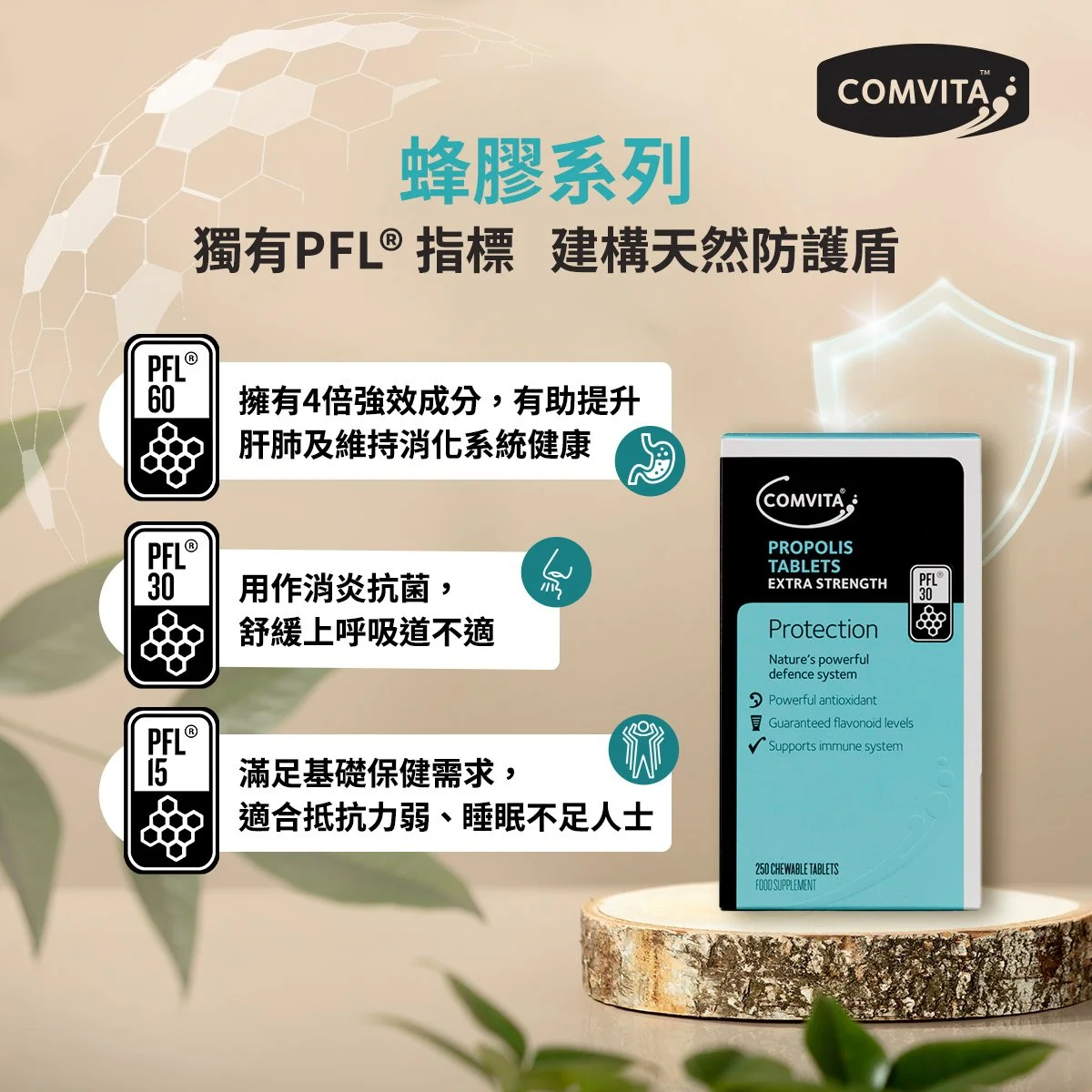
Demystifying Manuka: Translated complex concepts like UMF grading and health benefits into simple, visual explainers, helping consumers understand why Comvita stands apart.
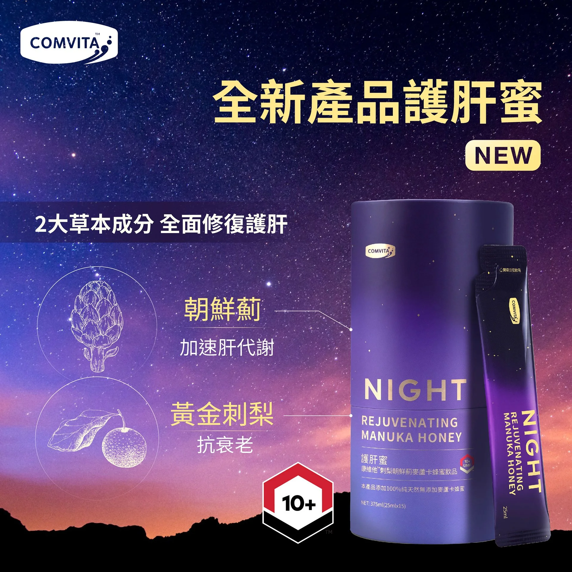
Expanding Use Cases: Positioned honey not only as a remedy but as a multi-dimensional wellness product—from skincare rituals to fitness recovery and culinary exploration.
Maintaining Scientific Authority: Balanced organic aesthetics with modern cues of trust: clean typography, subtle infographics, and muted palettes that evoked lab-grade precision without losing warmth.


Mindset & Impact
This project was about rethinking how consumers connect with a heritage brand—elevating honey from a cupboard remedy to a modern wellness essential. By applying a human-centered, insight-driven design approach, I created content that not only educated consumers but also positioned Comvita as a trusted, lifestyle-aligned brand.
Results
Strengthened Comvita’s digital presence and brand trust by repositioning its Manuka Honey as a premium wellness product. The campaign achieved a 45% increase in social engagement and a 25% uplift in online sales across Hong Kong and APAC markets, while reinforcing the brand’s connection to natural health and sustainability.