Carbon Brews
Lager Beer Packaging Design
Bold Simplicity for a Timeless Classic.
Deliverables:
Product Package Design
Carbon Brews is renowned for its playful, experimental beer designs—each seasonal release bursting with vibrant energy and artistic flair. But when the brewery decided to launch its first flagship Lager, the challenge was different: how do you create a design that feels reliable, iconic, and timeless, while still staying true to the brand’s adventurous DNA?
My Role: Concept Development · Packaging Design
Tools Used: Photoshop · Illustrator
Strategic Approach:
Balancing Legacy & Innovation
This project wasn’t just about designing another beer can—it was about shaping the visual cornerstone of the brand’s portfolio. My design approach focused on:
Category Differentiation: Carving out a mature, everyday identity for the Lager that stands apart from Carbon Brews’ whimsical limited editions.
Brand Continuity: Retaining subtle creative cues that tie back to the brewery’s innovative spirit, ensuring the Lager feels distinct yet undeniably part of the family.
Consumer Trust: Designing a product that communicates reliability and craft, appealing to drinkers who see Lager as an everyday choice.

Design Direction
*
Design Direction *
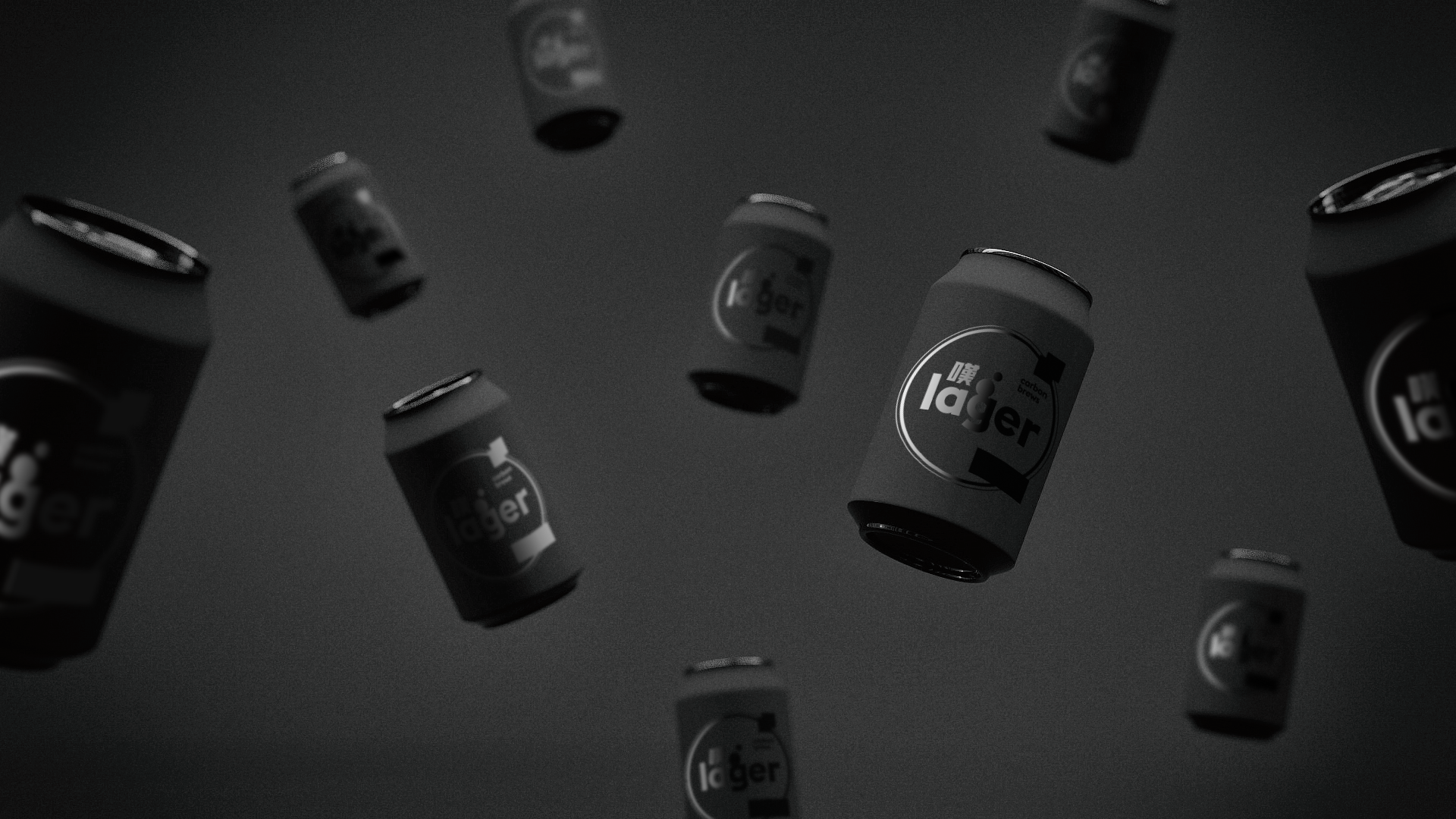
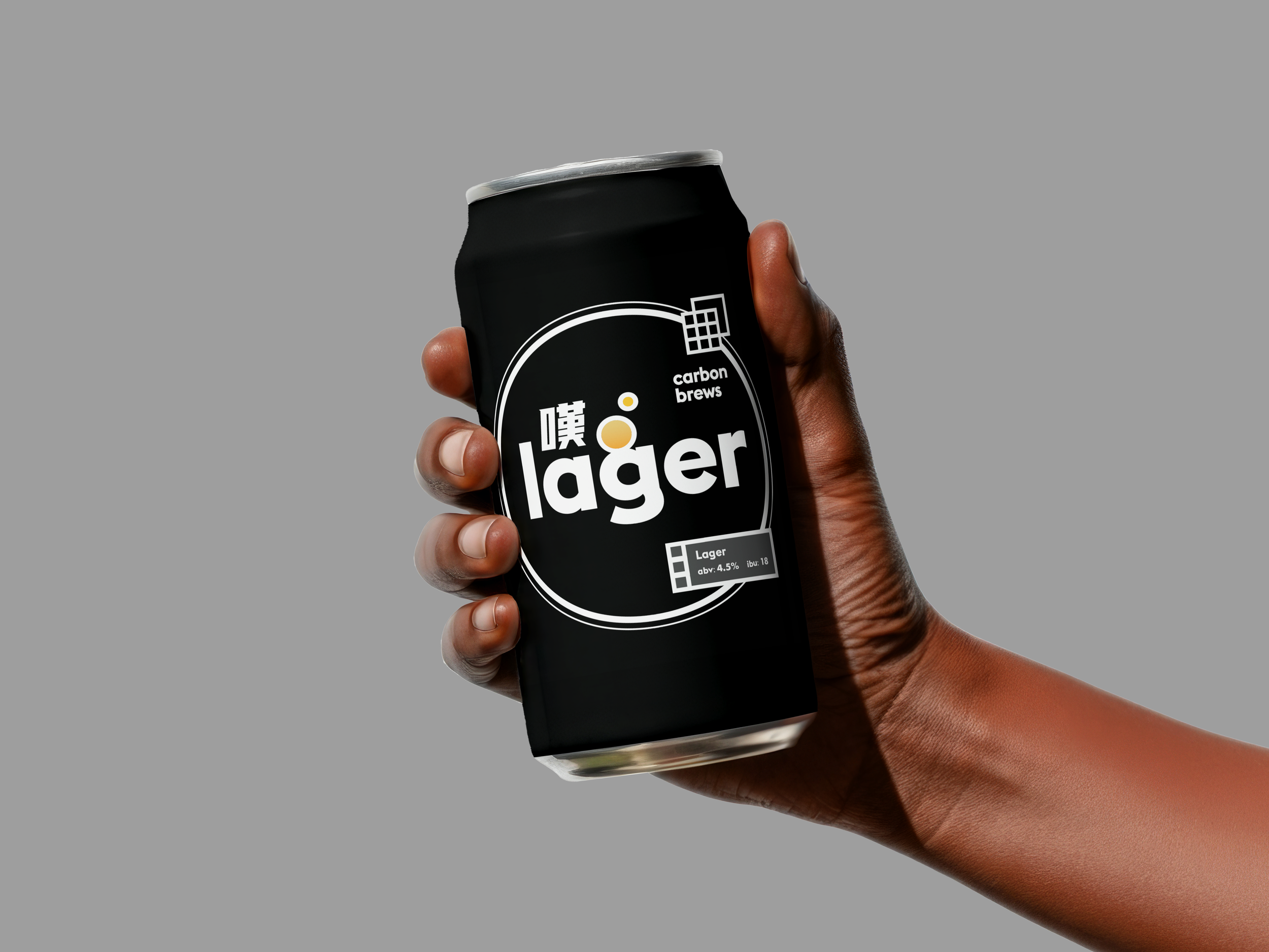
Black as Foundation: A bold, minimalist black backdrop delivers instant shelf impact, signaling strength, stability, and maturity.
Linear Simplicity: Clean line work and structured layouts reference the precision and tradition of brewing, giving the Lager an understated sophistication.
Yellow Bubble Element: A single, vibrant yellow “bubble” acts as the signature focal point—a modern nod to carbonation and freshness, iconic without being literal.
Mindset & Impact
I deliberately moved away from Carbon Brews’ usual playful visuals with the mantra: “Less Whimsy, More Impact.” This flagship design not only redefined the brand’s visual spectrum but also proved its versatility—showing that Carbon Brews can create both experimental seasonal designs and a timeless, everyday beer identity.

Results
The refreshed visual identity increased product visibility on shelves, boosted retail sales by 30% during launch, and garnered positive media and consumer attention for its bold, sustainable branding approach.